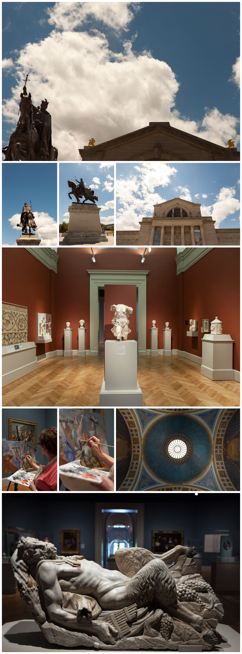
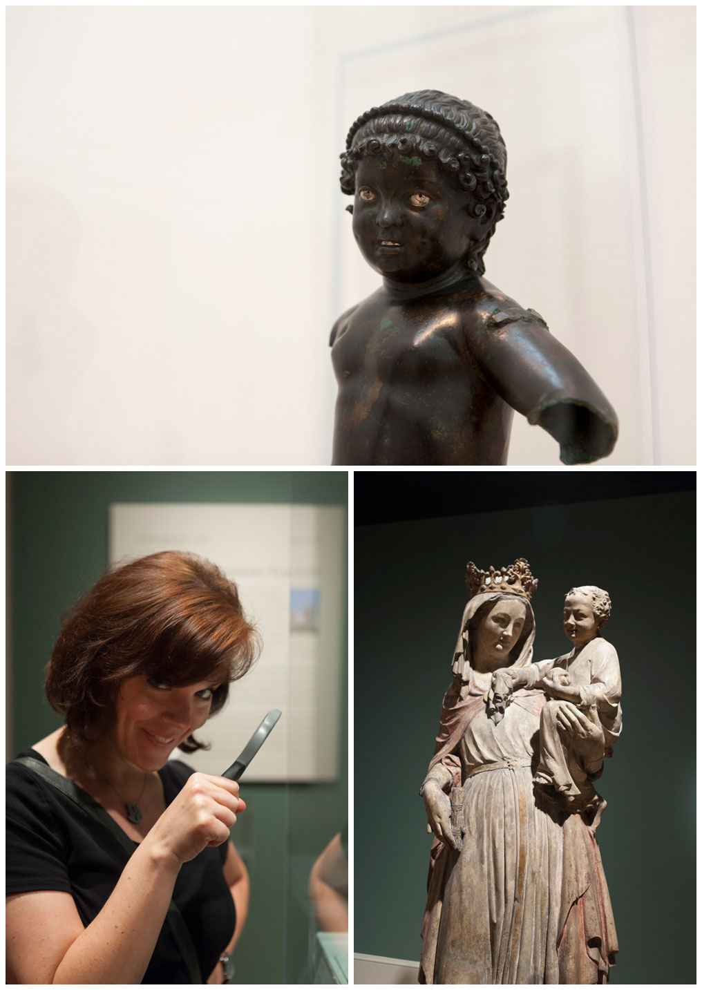
A few weeks ago I was in St. Louis visiting my friend Jennifer where we spent the day taking a few of the touristy things I had not done on previous trips. First up was the Saint Louis Art Museum. They have this beautiful new wing that was just added and house a pretty darn good collection of art! Funny thing when I was telling someone I had been there, they commented on how bad the signage was... Well you know that made my ears perk up. Come to find out, not the wayfinding signage, but the information about the works of art. They are very low contrast and are often on backgrounds that match the paint color of the wall. Now, I know this is because they want to keep from distracting from the art, but it does pose a problem for legibility. Jennifer and I had spotted magnifying glasses in each of the rooms and thought it was funny ... guess we know what we were supposed to use those for now huh..